goptions reset=all device=javaimg xpixels=240 ypixels=200;
ods listing close;
ods html style=listing;
proc gkpi mode=raised;
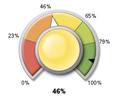
dial actual=.46 bounds=(0 .23 .46 .65 .79 1) /
target=.9 nolowbound format="percent8.0"
afont=(f="Albany AMT" height=.5cm)
bfont=(f="Albany AMT" height=.4cm) ;
run;
quit;
ods html close;
You can see how the value and the ranges are hard-coded in the example, but they could easily be data-driven through the use of macro variables (optionally, within a macro).
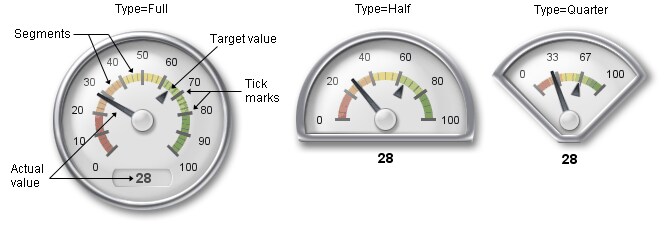
Individual dashboard elements are very nice, but a dashboard is not a dashboard unless it has a collection of elements on it in order to provide the anticipated overview and scope. So, it's important that we can combine the individual elemnets produced from GKPI into a whole dashboard.
PROC GKPI only works with DEV=JAVAIMG. We can use it to produce such as PNG files and then include them in HTML web pages. However, the fact that JAVAIMG is the only device means that GKPI does not write a GRSEG entry to a catalog; so you can't produce a bunch of dashboard items and then use PROC GREPLAY to combine them into a single image. The trick is to use annotate and PROC GSLIDE to include the image(s) into a slide, and then use PROC GREPLAY...... ANNOTATE LIVES!
Enterprise Guide 4.2 does not offer a nice visual interface to GKPI, but I'm assured that 4.3 will do so. However, as you've seen, it's pretty simple to set the right parameters and get some great graphics.
If you're one of those who believes that content and information are more important than presentation you may scoff at GKPI. However, SAS's customers have been asking for this functionality for some time, so you can't blame SAS for giving their customers what they want.

Finally, some general references...
SAS's Robert Allison offers a large variety of SAS dashboard examples (with code) on his personal web site. Note, in particular, his GKPI dashboard and the associated code that shows GKPI used with annotate.
If you're into dashboarding, you should take a look at Dashboards By Example for some great examples of clear, vivid dashboards (and some really bad ones too!). The apparently dormant Dashboard Spy was a favourite of mine too.
Stephen Few is a highly respected practitioner in the area of data visualisation. Take a look at his company web site. His blog is highly recommended (though the photo of him is somewhat questionable!).