There were many papers at SAS Global Forum 2013 on the upcoming 9.4 version of SAS. You can find many of them here. I recently saw a blog post from Robby Powell with a good summary of what to expect from 9.4. It's worth a look to see what will be available next month when 9.4 is released.
I already know of one major site in the UK that is planning to quickly upgrade to 9.4 to get the significant benefits of its clustered metadata servers (providing much-increased resilience). What are your plans?
Wednesday, 29 May 2013
Tuesday, 28 May 2013
NOTE: Adding Value to Your Metadata with Metacoda Commutual
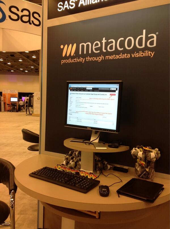
The Metacoda Security Plug-Ins are add-ons for SAS Management Console which improve the productivity of administrators working on SAS metadata security. They provide clearer views of your security ACTs and ACEs together with the access that your security rules are giving to groups, roles and users. Over the years, the Plug-Ins have grown into a powerful and valuable tool.
First mentioned on this blog back in November last year, Metacoda Commutual is a web application for searching and collaborating around business and technical metadata in SAS, including discussions and notification of changes to items of interest. As I said in November, "I think the idea has great merit. Metadata is not just a technical thing; it represents the objects that are important to our business."
The Metacoda web site has a lot more information on Commutual, here’s a quick summary of the main focus areas of the new product:
- Activity: get notified about any changes and discussions on items of interest to you
- Search: find the items you want and register your interest in seeing activity for them
- Discussions: share your knowledge and learn from the knowledge and experience of others
- Easy Access: get easy access from anywhere: browsers on desktop PCs, tablets, or smart phones, and even custom applications, add-ons, and plug-ins
- Performance: to make it as fast as we can, so you can find what you need, when you want it, and don’t miss out on shared knowledge because it takes too long or it’s too hard to find
- Security: only provide access to metadata you normally have access to
[UPDATE. Metacoda have posted a video demonstration of Commutual, so you can see it in action]
Wednesday, 22 May 2013
Recent Writing (Infomous)
I recently added a new widget to the right margin of the NOTE: blog - "Recent Topics". It's a form of word cloud, but it's far more dynamic and interactive than a traditional word cloud. Hover over a word (or click on it) to see a list of NOTE: articles featuring the specified word; click Drill-Down to get a sub-cloud of associated words.
If you don't subscribe to NOTE: (through RSS or email) then it can be especially difficult to make the best use of the blog's content. The new widget shows words from the most recent 25 NOTE: posts and I think it will be of benefit for catching-up on recent content that is of interest to you.
The word cloud is supplied by Infomous. Hover your mouse near the bottom of the diagram for a menu of options. From the Infomous FAQ:
- The size of each word reflects the frequency with which it appears in the source
- If you click on a word, a drop down list appears with links to articles that are related to the specific word. The drop-down will also appear if your mouse lingers over a word. By clicking on a link in the list, you will navigate to that specific article
- Topics become linked when they are mentioned in the same context or discussed together multiple times. Related terms and concepts are linked together with lines so you can grasp the context of any relevant topic
- The words in the Infomous cloud are organized in groups of related words. This provides you with a quick glimpse of which topics belong together in conceptual clusters
Tuesday, 21 May 2013
NOTE: Infographics with SAS
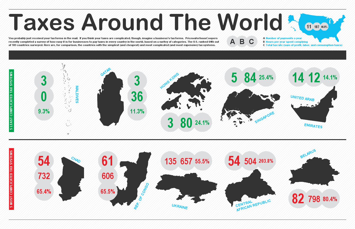
As Rob says in his post, there's no firm definition of the term "infographic", but I think Rob's description sums it up nicely: something half way between data visualisation & artwork. SAS graphics are typically created straight from the data - rightly so - but infographics then apply some analysis and some presentational elements in order to enrich the result.
In his post, and links to his site, Rob describes how he created the half dozen samples that Rob includes in the post.
Whilst there's no specific mention of infographics, there is rich store of information about creating SAS graphics in this year's SAS Global Forum proceedings. See the Reporting and Information Visualisation stream, and the Posters stream.
To experiment with infographics and try ideas and styles, there are some useful online resources such as Infogr.am which allow you to create infographics with a set of tools intended specifically for creating infographics.
It's important to produce accurate graphics, but making them attractive and approachable will mean more people get to see the fruits of your labours. And if you're in the right position to apply some interpretation to the material then so much the better. And it can be fun letting your artistic side have a little space to express itself!
Wednesday, 15 May 2013
Affinity Diagrams for Problem Solving #sasgf13

DMAIC is an excellent end-to-end process to give structure to your whole problem solving endeavour. 5 Whys is a flexible technique for probing root causes. Ishikawa is a terrific approach to information gathering and helps ensure comprehensive coverage of the problem area.
The bottom-up idea can sound unstructured, but is it ever a bad thing to have too many ideas? Probably not, but if you've ever experienced information overload or struggled to know where to begin with a wealth of data you've been given, you may have wondered how you can use all of these ideas effectively.
When there's lots of "stuff" coming at you, it is hard to sort through everything and organise the information in a way that makes sense and helps you make decisions. Whether you're brainstorming ideas, trying to solve a problem or analysing a situation, when you are dealing with lots of information from a variety of sources, you can end up spending a huge amount of time trying to assimilate all the little bits and pieces. Rather than letting the disjointed information get the better of you, you can use an Affinity diagram to help you organise it.
Also called the KJ method, after its developer Kawakita Jiro (a Japanese anthropologist) an Affinity diagram helps to organise large amounts of data by finding relationships between ideas. The information is then gradually structured from the bottom up into meaningful groups. From there you can clearly "see" what you have, and then begin your analysis or come to a decision.
Here’s how it works:
- Make sure you have a good definition of your problem (ref: DMAIC)
- Use a brainstorm exercise (or similar) to generate ideas, writing each on a sticky note. Remember that it’s a brainstorm session, so don’t restrict the number of ideas/notes, don’t be judgemental, don’t be afraid to re-use and enhance ideas on existing sticky notes, and don’t try to start solving the problem (yet)
- Now that you have a wall full of sticky notes, sort the ideas into themes. Look for similar or connected ideas. This is similar to the Ishikawa’s ribs, but we’re working bottom-up, and we’re not constrained a by a set of ribs as our start points. When you’re doing this, it may help to split everybody into smaller teams
- Aim for complete agreement amongst all attendees. Discuss each other’s opinions and move the sticky notes around until agreement is reached. You may find some ideas that are completely unrelated to all other ideas; in which case, you can put them into an “Unrelated” group
- Now create a sticky note for each theme and then super-themes, etc. until you've reached the highest meaningful level of categorisation. Arrange the sticky notes to reflect the hierarchical structure of the (super)themes
Affinity diagrams are great tools for assimilating and understanding large amounts of information. When you work through the process of creating relationships and working backward from detailed information to broad themes, you get an insight you would not otherwise find. The next time you are confronting a large amount of information or number of ideas and you feel overwhelmed at first glance, use the Affinity diagram approach to discover all the hidden linkages. When you cannot see the forest for the trees, an Affinity diagram may be exactly what you need to get back in focus.
If you'd like to know more about some of the other techniques, you can catch an audiovisual recording of my whole paper on Brainshark.
Tuesday, 14 May 2013
Predictive Analytics in the 17th Century

From humble beginnings as a haberdasher, he rose to the respect of King Charles II and was elected a member of the Royal Society. Graunt was a self-educated man, yet the statistical, epidemiological and demographic work evidenced in his Observations set him out as a pioneer. 350 years ago, Graunt was doing what we might now call "public health intelligence". Graunt calculated that 36% of children didn't reach the age 6 (a startling figure by today's standards). With further categorisation and analysis, he deduced that people were dying of causes unrelated to age - preventable diseases.
 |
| Graunt's 17C London |
Further reading:
Excerpt from The Lancet, 1996:
http://www.epidemiology.ch/history/PDF%20bg/Rothman%20KJ%20lessons%20from%20john%20graunt.pdf
Ed Stephan's collection:
http://www.edstephan.org/Graunt/graunt.html
StatProbe Encyclopedia:
http://statprob.com/encyclopedia/JohnGRAUNT.html
Thursday, 9 May 2013
NOTE: Metadata-Bound Libraries - Updates at SGF 2013 #sasgf13
Back in November last year I mentioned Metadata-Bound Libraries. This v9.3 M2 (and above) functionality allows you to force access to your data through metadata libraries, thereby enforcing your metadata security plans.
One of the nuggets of information I learned at SAS Global Forum 2013 was that v9.4 will introduce menus in SAS Management Console to ease the effort of building PROC AUTHLIB code. Plus, the process of unbinding data sets from the metadata libraries will be made easier and simpler. Currently, one has to copy the data sets to an unbound library; v9.4 will allow unbinding to be performed in-place.
In a future release, administrators will optionally be able to make encryption compulsory for all data sets and libraries; and support for AES encryption will be provided. Finally, the metadata server will be able to store the encryption key and send it (encrypted) when required. This will remove the current need to hard-code keys into batch code (and thereby remove the security weakness).
NOTE: SAS Global Forum 2014 #sasgf14
No sooner has SAS Global Forum 2013 finished than we get to see the 2014 web site. Next year's conference is in Washington, D.C. between March 23rd and 26th.
I hear there are some changes afoot in the organisation of the conference. Along with the absence of a Closing Session at this year's conference, there was no announcement of section chairs for the streams of papers in next year's conference. The web site offers no further information on section chairs, but it does tell us that the Call For Content opens in July. This appears to be different to previous years' Call For Papers, and it's much earlier in the year too. All-in-all, I'm intrigued to see what the plan is.
I clearly need to get my skates on and do more than just think about next year's papers over the next few months.
Wednesday, 8 May 2013
Improve Your Mobile Typing (KALQ)
I didn't see this paper presented at SAS Global Forum(!) even though there's plenty of pattern matching and analytics involved in the project, but maybe I'd have benefited from having the associated software installed on my Android tablet whilst writing notes and blog posts.
It's (yet another) alternative keyboard for mobile (phone and tablet) devices. It dares to diverge from QWERTY, and it's thumb-focused, i.e. it doesn't expect you to be a Mavis Beacon alumni. Thus, the researchers claim "it will take about 8 hours of practice to reach the typing rate that is comparable to that of a regular Qwerty keyboard on the same device. Practice beyond that point will improve the rate further". However, it promises much because the layout has the following properties:
I'll confess. I bought a Nexus 7 in San Francisco, sitting alongside my Galaxy Nexus phone and my Asus TF101 tablet/laptop. Yes, I'm an Android fan. But, in my defence, the battery on my Asus had run dry and I'd brought the wrong recharging kit, so what was I to do!
I saw a lot of people at SGF writing notes on tablets and phones, so KALQ has a large target market. I'm going to try it on my Nexus 7. I'll let you know if it's a success.
It's (yet another) alternative keyboard for mobile (phone and tablet) devices. It dares to diverge from QWERTY, and it's thumb-focused, i.e. it doesn't expect you to be a Mavis Beacon alumni. Thus, the researchers claim "it will take about 8 hours of practice to reach the typing rate that is comparable to that of a regular Qwerty keyboard on the same device. Practice beyond that point will improve the rate further". However, it promises much because the layout has the following properties:
- The division of work is almost equal, at 54% and 46% for the right and left thumb, respectively.
- Alternation is rapid: 62% of the taps are switches.
- Travel distances are short: On average, the left thumb moves 86 px, the right 117.
- The space bar is centrally located.
- The right thumb handles all vowels except y. The clustering of vowels around the space bar favours quick switches and minimises travel distance. The right thumb is responsible for 64% of same-side taps.
- The left thumb has most of the consonants, exploiting its ability to hover above the next button sooner. It has most first letters of words and most of the consonants.
I'll confess. I bought a Nexus 7 in San Francisco, sitting alongside my Galaxy Nexus phone and my Asus TF101 tablet/laptop. Yes, I'm an Android fan. But, in my defence, the battery on my Asus had run dry and I'd brought the wrong recharging kit, so what was I to do!
I saw a lot of people at SGF writing notes on tablets and phones, so KALQ has a large target market. I'm going to try it on my Nexus 7. I'll let you know if it's a success.
NOTE: High-Availability Metadata #sasgf13

For those with SAS systems providing high value operational services, this enhancement could be a key deciding factor in choosing to upgrade to v9.4. Sites with less demanding applications can choose to retain a single metadata server.
Whilst SAS has hitherto offered a large degree of resilience for failure of most processes and servers (particularly with the use of Grid and EGO), the metadata server has always been a weak link. V9.4 resolves this shortcoming by introducing the ability to cluster a group of metadata servers, all of whom are running 24x7, communicating with each other, and able to take-over the work of a failed metadata server.
The coordinated cluster of metadata servers appears as a normal metadata server to SAS users. Hence, no code changes will be required if your site implements this technology. The chosen approach is intrinsically scalable.
The cluster requires three or more nodes; each is a full metadata server. One is nominally a master, the others are slaves. The system decides who is the master at any point in time. Each metadata server must have access to a shared backup disk area.
Client connections go to slaves. Load balancing causes redirects when required. The load balancing means that read performance is the same or better when compared with v9.3 performance. To keep all metadata server instances synchronised, slaves pass write requests to the master, and the master then passes those requests asynchronously to all other slaves so that they can update their own copy of the metadata storage (in-memory and on disk).
SAS clients (such as Enterprise Guide and Data Integration Studio) keep a list of all nodes. Each client is responsible for reconnection. This is transparent to users. Hence, in the event of a slave failure, the client will automatically establish communication with an alternate server. If the master fails, the remaining slaves need to negitiate with each other to "elect" a new master. As a result, there can be a more noticeable delay, although it's unlikely to exceed 10 seconds.
The new functionality will be supported in v9.4 on all SAS platforms except IBM Z/OS. All metadata servers must be on the same OS. The cluster license is included in SAS Integration Technologies. Unlike some of SAS's other high availability and failover solutions, no additional 3rd party software is required.
All-in-all, this is a very significant enhancement for those who rely on their SAS systems to reliably deliver information, knowledge and decisions.
Monday, 6 May 2013
NOTE: SAS Global Forum 2013 Feedback #sasgf13
I just completed the conference survey. Overall I had a good conference - nobody booed during either of my papers, so that's a positive outcome! I liked the conference city (San Francisco), the conference venue was relatively compact (avoiding long walks between papers), I attended a number of well-presented papers, I learned useful stuff about current releases of SAS plus additional stuff about forthcoming SAS releases and how to plan for them.
I tried to offer some constructive feedback in my survey. Here's what I wrote. What do you think? Did your experiences match (or diverge)?
I tried to offer some constructive feedback in my survey. Here's what I wrote. What do you think? Did your experiences match (or diverge)?
- I was very disappointed to see the loss of the Closing Session. It felt like the conference just petered-out. There was no opportunity to say "thank you" to organisers and volunteers, and no recognition for presenters (best paper??). A big shame
- I was greatly disappointed with the conference wi-fi. Even stood in one place it still seemed to come-and-go, and required a fresh login every time the signal was lost. As an overseas attendee (with very expensive data rates because I was roaming) I relied on conference wi-fi to keep in touch with emails, etc. The wi-fi caused me huge frustration
- I'd like a few more papers on general software development best practice, e.g. requirement, design and testing. It's great to learn about the technology and the language(s), but my clients' investments are wasted if they don't build stuff effectively and efficiently. So, I don't mean papers about syntax, I mean advice, recommendations and experience about the operation of a SAS development and support team
- I liked the conference's Android app. Hopefully it'll be a bit more "finished" next year, e.g. maps of the venue included in the app rather than requiring an internet connection to access them (see my comments re: conference wi-fi above). The ability to search for papers by name-of-author would be appreciated. An ability to filter My Agenda would be much appreciated because it involved a lot of scrolling to see my plans for Wednesday (having to scroll past Sunday, Monday and Tuesday to see Wednesday)
- I enjoyed the keynotes from Billy Beane and Roger Craig. Both were eloquent and amusing speakers, but both were talking about analytics and hence there was a strong tie-in with the conference.
Wednesday, 1 May 2013
NOTE: Editing SAS #sasgf13
I don't get to write many SAS programs these days, less still Base SAS code. However, I couldn't help but be impressed by the Macumba editor that was described and demonstrated by Michael Weisz of Bayer Pharma yesterday at SAS Global Forum. Sadly, it is not commercially available. The ability to do DATA step debugging *and* macro debugging blew me away.
Subscribe to:
Posts (Atom)