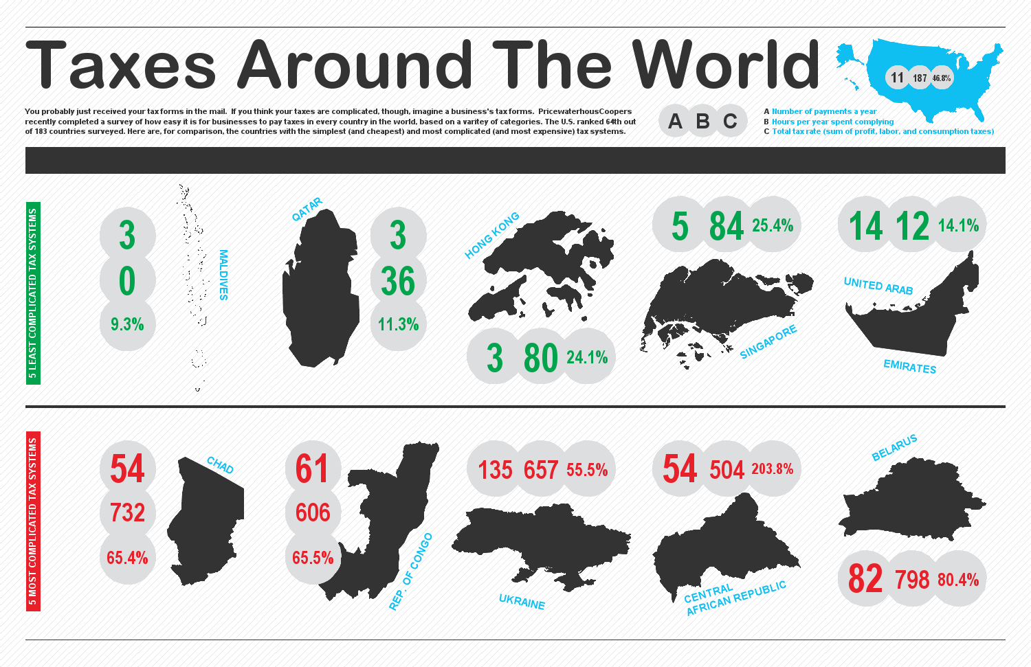
I saw a nice post by Rob Allison last month on creating infographics with SAS. Whilst we mostly endeavour to create hi-fidelity graphics in SAS that show a relatively high volume of detailed graphical information, there are a wide variety of uses for graphical presentation. Infographics should not be overlooked.
As Rob says in his post, there's no firm definition of the term "infographic", but I think Rob's description sums it up nicely: something half way between data visualisation & artwork. SAS graphics are typically created straight from the data - rightly so - but infographics then apply some analysis and some presentational elements in order to enrich the result.
In his post, and links to his site, Rob describes how he created the half dozen samples that Rob includes in the post.
Whilst there's no specific mention of infographics, there is rich store of information about creating SAS graphics in this year's SAS Global Forum proceedings. See the Reporting and Information Visualisation stream, and the Posters stream.
To experiment with infographics and try ideas and styles, there are some useful online resources such as Infogr.am which allow you to create infographics with a set of tools intended specifically for creating infographics.
It's important to produce accurate graphics, but making them attractive and approachable will mean more people get to see the fruits of your labours. And if you're in the right position to apply some interpretation to the material then so much the better. And it can be fun letting your artistic side have a little space to express itself!
