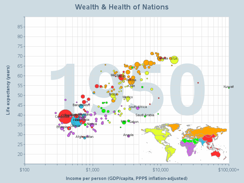
Rob's reference relates to the subject of a 2010 post from me (originally highlighted by a tweet from Chris Hemedinger) in which Herr Rosling shows his own work in some superb graphics, aided by the BBC.
Rob's re-production of the animated graphics is achieved through use of some v9.4 SAS/GRAPH features. Independently, Rob has documented a vast array of v9.4 SAS/GRAPH features on his web site.
At first sight, this kind of work might appear to be more art than science, more infographic than statistical chart, but it does a very effective job of getting its analytical point across. And it neatly brings us back to last month's post on infographics, spurred by a different post from Rob!